Who really emits the most CO₂
Welcome to Mapped — one dataset turned into one map, every week. This week: carbon emissions.
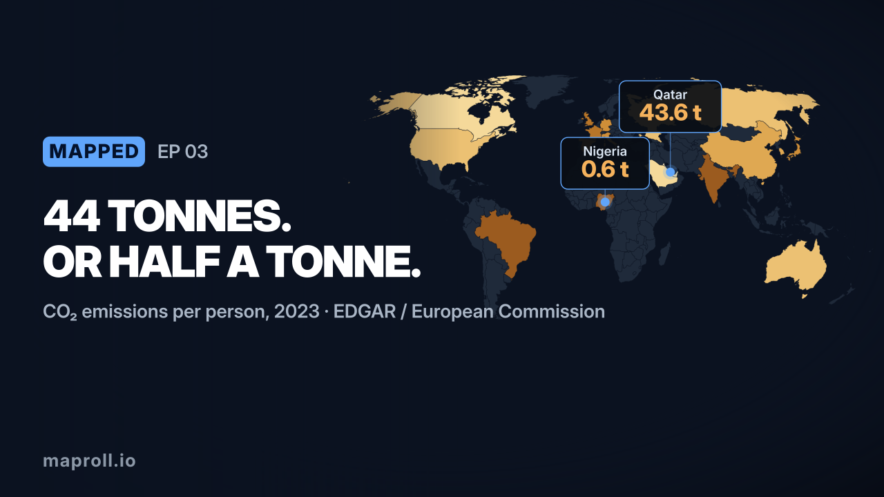
When people picture the world’s biggest polluters, they picture China and the United States — and in raw totals, they’re right. But divide emissions by population and the map flips completely. Per person, the heaviest emitters on Earth are the Gulf states.

Remix this map → Opens this exact map in the editor, data included. Change the numbers, the palette, the country. It’s your copy.
What you’re looking at
Qatar tops the world at nearly 44 tonnes of CO₂ per person per year — more than three times the United States, and roughly 75 times Nigeria. Kuwait, the UAE and Saudi Arabia follow: small populations, huge fossil-fuel economies, and energy-hungry desert air-conditioning.
Then come the big rich countries you’d expect — Canada, Australia and the US all around 14 tonnes — driven by cars, sprawl and heating. China, the world’s largest total emitter, sits at about 9 tonnes per person — high and rising, but still below the wealthy West on a per-head basis.
The most interesting story is the low-carbon developed world. France emits just 4.25 tonnes per person — less than half of China, and below the UK, Italy and Germany. The reason is one policy choice made decades ago: France runs most of its grid on nuclear power. It’s the clearest example on the map of how the source of energy, not just the wealth of a country, shapes its footprint.
The takeaway
Total emissions tell you which country to negotiate with. Per-capita emissions tell you who’s actually living a high-carbon life — and it isn’t always who you think.
Make this map yourself
One URL, no toolchain:
https://api.maproll.io/map.svg?scope=world
  &data=QA:43.55,KW:24.9,US:13.83,CN:9.24,FR:4.25...
  &theme=dark-blue&legendTitle=tonnes%20per%20person
Swap the data for your own, change the palette, embed it anywhere. Remix this map → or start from scratch.
Source: CO₂ emissions per capita, EDGAR / European Commission, 2023 (fossil fuels and cement). Next week on Mapped: where people live longest.