FOR RESEARCH AND POLICY
Maps that belong in the report
Your data has a geographic dimension. That does not mean the project needs a GIS stack, a licence and a specialist.
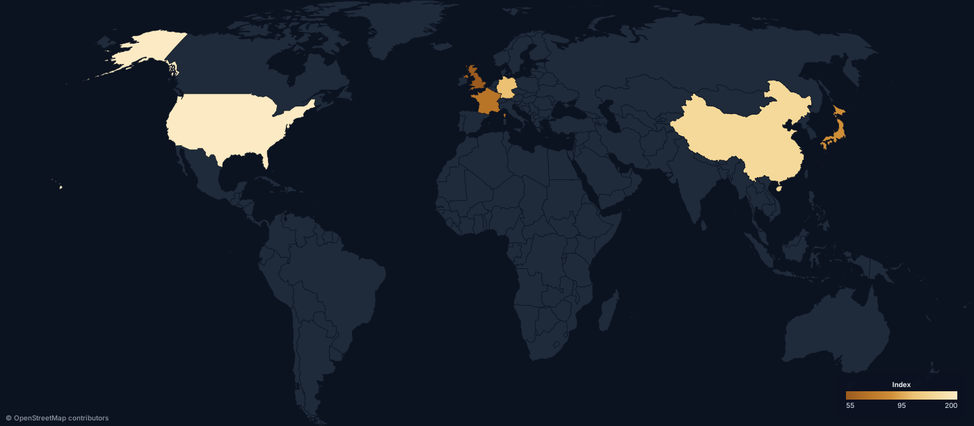
Between the spreadsheet and the GIS project
Most report maps are one variable per region. That is a ten-minute job that too often turns into a week of tooling.
boundaries, bins, legend, title.
Vector SVG for print and layout, PNG when the template wants a raster.
Demographics, economic indicators, public health, infrastructure, climate, trade, political geography, logistics, regional comparisons, survey results.
177 countries with ISO 3166-2 subdivisions, 16 group scopes, up to 5,000 regions per map.
Classify the data honestly
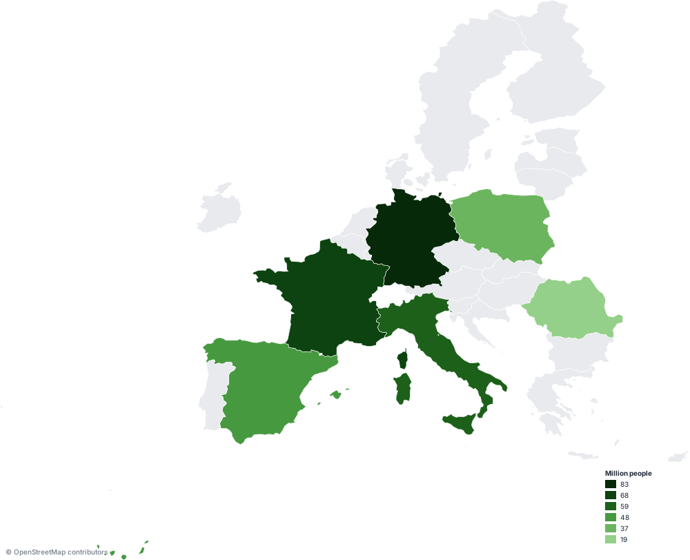
Sequential for magnitude, diverging when values sit either side of a midpoint, categorical for types rather than amounts.
Quantile, Jenks natural breaks, equal interval, or explicit breaks when the thresholds are the finding.
The legend is drawn from the same numbers, so the figure and the caption cannot drift apart.
Some findings are about movement
Trade, shipping, supply chains, migration, transport and travel are flows, not fills.
Great-circle lines for air and abstract flows. Add sea to a route and it is path-found across the Eurostat marnet — the real lanes through Suez, Panama and Malacca — instead of a straight line over Asia.
Endpoints snap to the nearest lane vertex, so treat it as a schematic corridor rather than a navigational route.
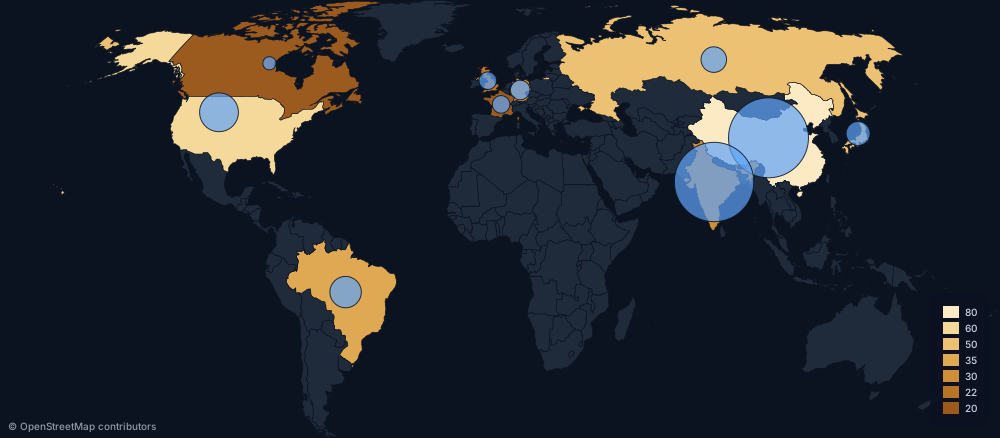
Colour for one variable, circle area for another. Area scales with the value, not the radius.
Reproducible because it is a request
The map is fully described by its URL or its POST body. Keep that next to the analysis, rerun it when the data is revised, and the figure regenerates exactly.
No manual recreation, no "final_v3_revised.ai", no memory of which settings produced figure 4.
POST a JSON or CSV body straight from the pipeline that produced the table.
Validate region IDs first with the scope catalog, and read X-Geo-Warnings to see which rows were skipped.
The cartographic details a reviewer notices
Overlays
North arrow, kilometre scale bar and a 10° graticule, each an independent toggle. Region labels use ISO codes rather than names.
Projections and themes
Five projections, including Equal Earth for area-honest world maps and Albers for the US. Six themes, light and dark.
Patterns for missing data
Five pattern fills — stripes, dots, crosshatch and more — for no-data regions, disputed territory or a second variable.
From analysis to figure
Create a free accountRead the API docsPublishing on a deadline instead? The newsroom page covers that workflow.