FOR WRITERS AND CREATORS
Give the statistic a map
Three paragraphs explaining where something happens, or one map. Describe it, adjust it, copy the link.
Founding members get a year free. No credit card. Magic-link sign-in.
Some stories are geographic and you already know it
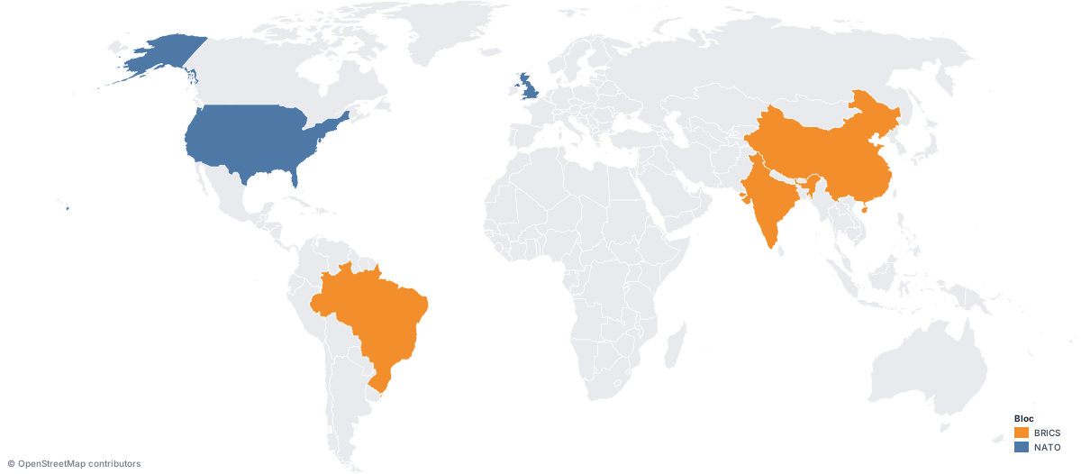
Where is adoption growing fastest. Which countries spend the most. Where the product sells. How a route crosses the world. Which countries are in the bloc.
The answer is a shape, not a sentence.
Say it in plain English, then tune it
Sign in and describe the map you want. You get a live result to work from, and you keep talking to it: change the theme, highlight another country, add airports, draw the shipping route.
Nothing is rebuilt from scratch when you change your mind, because the map is a set of parameters, not a drawing.
Prefer to do it by hand? Every control is in the editor, and every map is still a URL underneath.
Built to be pasted somewhere
Newsletters and email
Use the PNG. Email clients and social crawlers do not render SVG. Any width up to 8,000 px.
Articles and blogs
Use the SVG in an image tag. It stays sharp on any screen and weighs less than a screenshot.
Social and slides
Render a title and subtitle into the image itself, so the map still makes sense when it travels without your copy.
Not pins on a street map
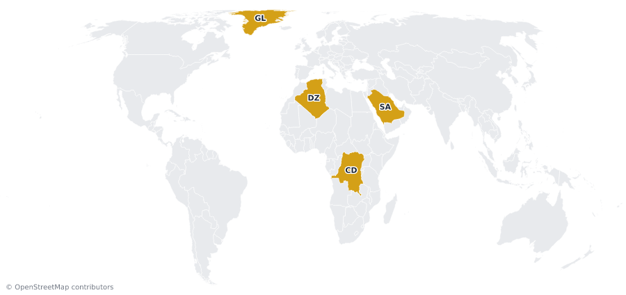
Choropleths, highlighted countries, categorical fills, proportional circles, routes and sea lanes, markers with 30 icons, pattern fills, five projections and six themes.
Legends and cartographic details when they help the reader, off when they are clutter.
MAPPED — OUR WEEKLY MAP SERIES
One dataset. One map. Every week.
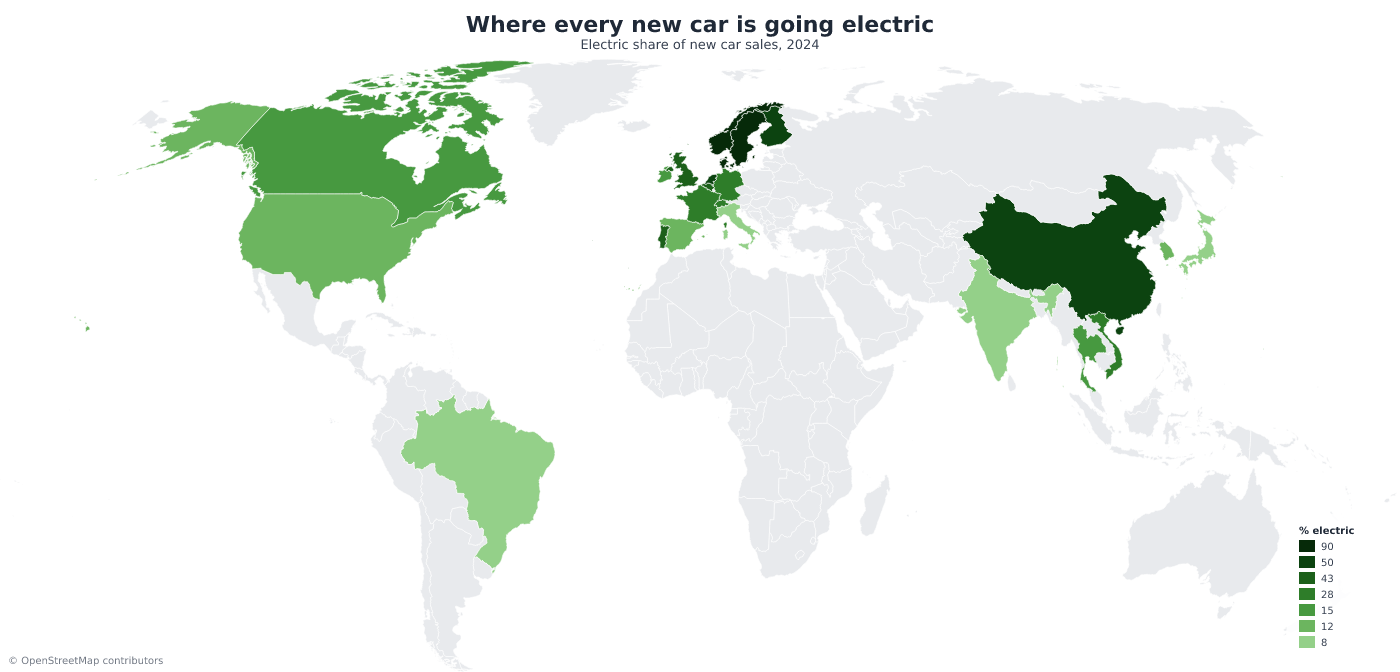
We turn the numbers behind the news into clean, shareable maps — how big Greenland really is, where cars went electric, where the Dutch live. Steal the format.
Make the next one yours
Create a free accountRead the docsWant one map generated automatically for every issue? That is one GET request.