FOR NEWSROOMS
Make the map before the story gets old
A deadline is not the time to open a GIS project. Describe the map, refine it on screen, copy the URL into your CMS.
Founding members get a year free. No credit card. Magic-link sign-in.
Start with the story, not the software
Sign in and tell the map builder what you need:
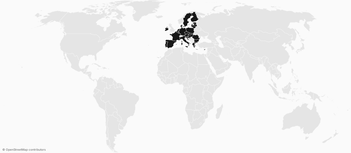
"Highlight the EU countries."
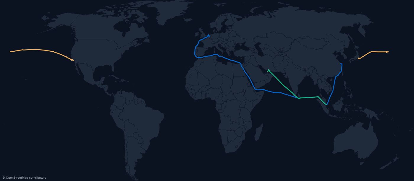
"Show the shipping route from Shanghai to Rotterdam through Suez."
"Map military spending by country and size the circles by population."
"Put airport markers on Berlin, London and Tokyo."
You get a live map back and keep refining it — theme, colours, labels, one more country — without rebuilding the graphic each time.
The maps a newsroom actually files
Politics and elections
Results by country, state or constituency across 177 countries with subdivisions, plus blocs like EU, NATO and G20 as one token.
Trade, conflict and logistics
Sea routes that follow real shipping lanes, great-circle flows, ports and airports, and NATO APP-6 symbols when the story is military.
Economy, climate and health
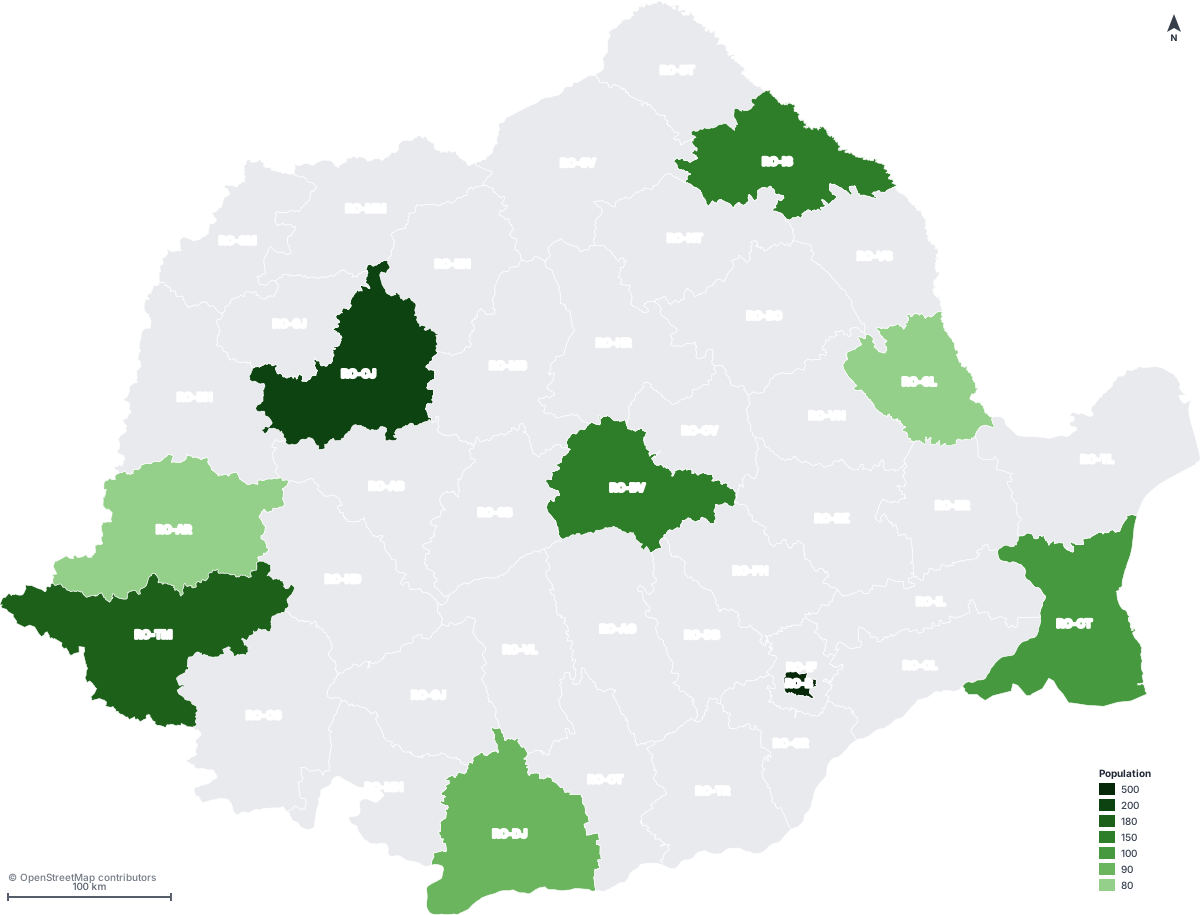
Choropleths with the bins chosen properly — quantile, Jenks, equal interval or your own breaks — so the map does not oversell the data.
It should look filed, not exported
Six themes, light and dark. Five projections. Clean boundaries at three detail levels, so a thumbnail and a full-page render both hold up.
Legends, region code labels, north arrow, scale bar, graticule and pattern fills — on when the story needs them, off when they are noise.
Titles and subtitles render into the image, so the credit travels with the map.
One link, and it keeps working
When the map is right, copy its URL and drop it into the CMS like any image. No embed script to maintain, no iframe, no visualisation bundle to keep alive after the reporter moves on.
Save it to a project and the same map reopens in the editor for the follow-up story.
Use SVG in the article and PNG for the social card — social crawlers do not render SVG.
Fast for one story. Repeatable for a desk.
For the story you are filing in ten minutes, describe it and publish.
For the graphic that runs every week, generate it from the URL API — same renderer, same output, no hand work.
Mapped is our own weekly series: one dataset, one map. It is where we show the craft in public.
Make the map. File the story.
Create a free accountRead the docsResearch or policy work instead of daily news? There is a page for that.