Where people live longest
Welcome to Mapped — one dataset turned into one map, every week. This week: how long a life lasts.
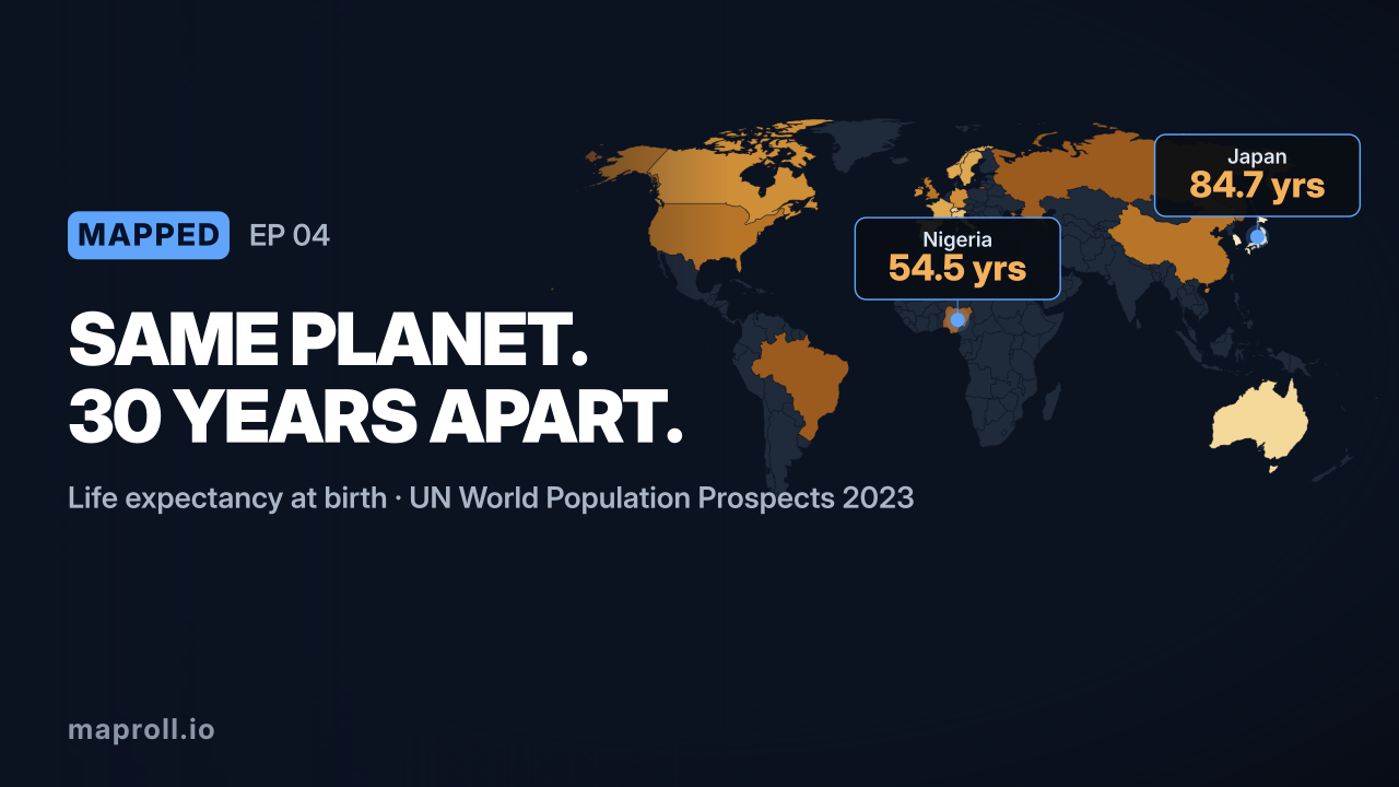
Of all the numbers you can put on a map, life expectancy might be the most human. It compresses a country’s healthcare, diet, wealth, safety and peace into a single figure: how many years a baby born today can expect to live. And the gap between the top and the bottom is staggering — around 30 years.

Remix this map → Opens this exact map in the editor, data included. Change the numbers, the palette, the country. It’s your copy.
What you’re looking at
At the top sits Japan, around 84.7 years — a product of diet, universal healthcare and a famously long-lived population. Close behind come South Korea, Switzerland, Australia, Singapore, Italy and Spain, all clustered near 84. The healthy-long-life club is small, rich, and mostly split between Western Europe and the wealthy Pacific.
The United States is a notable outlier at about 79.3 years — several years behind other high-income countries despite spending far more per person on healthcare than any of them. It’s one of the sharpest anomalies on the whole map.
At the other end, Nigeria sits near 54.5 years — the kind of figure that was normal everywhere just a century ago. The countries at the bottom of this list are largely in sub-Saharan Africa, where infectious disease, maternal and infant mortality, and fragile health systems still pull the average down by decades.
The takeaway
The single most important thing about your life expectancy is something you never chose: the country you were born in.
Make this map yourself
The map above is one maproll URL:
https://api.maproll.io/map.svg?scope=world
  &data=JP:84.7,CH:84,US:79.3,NG:54.5...
  &theme=light-mono&legendTitle=Years
Change the data, pick a palette, and embed it anywhere an image works. Remix this map → or start from scratch.
Source: List of countries by life expectancy, UN World Population Prospects 2023 (life expectancy at birth, both sexes). That wraps the first month of Mapped — subscribe below to get next week’s map in your inbox.